Updating AudioEye’s New Visual Toolkit

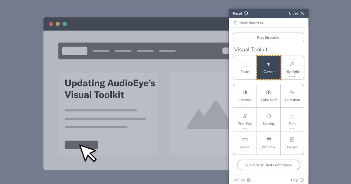
We’ve added new features to our Visual Toolkit, further enhancing usability with an updated modern layout and design, making it easier for users to find and access features. The Visual Toolkit was designed to provide easy personalization features for users who need to adjust visual elements on the website, like enlarging the cursor and fonts, improving contrast, removing harmful animations, and much more.
Feature updates:
- New, lightweight design: Takes less space on the website while improving usability and site performance
- Dark theme and icon color: Select between light and dark themes, and customize colors to better match your website’s branding
- Mobile view: A scaled-down version optimized for mobile browsers
In addition, the Visual Toolkit continues to provide a suite of tools enabling the user to customize their visual experience:
- Focus: draws a colorful box around buttons and links, making them easier to find and select for visual keyboard users.
- Cursor: enlarges the cursor display for ease of tracking and improves usability for low-vision users. Users no longer have to track a tiny mouse arrow across the screen.
- Highlight: Applies a bright highlight over either headings, links, or the entire text for visual keyboard users.
- Contrast: Provides options to sharpen the image, desaturate to remove color, and invert color elements into sharper contrast. To better understand the importance of color contrast, visit our Color Contrast Checker.
- Color Shift: Shifts the color wheel allowing users with different forms of color blindness to perceive more contrast between colors.
- Animation: Eliminates potential hazards, like moving or flashing animations that may trigger epileptic seizures.
- Text Size: Enlarges website body and headline copy to improve readability and usability for low-vision users.
- Spacing: Changes the distance between words and lines of text to improve readability for users.
- Font: Changes the typeface on pages to improve readability and includes a font intended to assist individuals with dyslexia.
- Guide: Enhances focus and improves reading comprehension by creating a horizontal line controlled by the cursor position.
- Window: enhances focus and improves reading comprehension by blurring out the majority of the page view as controlled by the cursor position. Users can focus on just one line of text at a time.
- Images: Shows the alternative text that describes the images and buttons on the site when hovered over with the cursor.
Each individual tool in the Visual Toolkit can be combined with the others to make for a truly personalized and usable experience. This experience is consistent across all sites that have AudioEye’s Visual Toolkit enabled, and works for onsite iFrames, meaning embedded content will also enjoy the same enhancements.
The fact is, there’s little consistency about the best ways in which to make the visual portions of a site more usable to people with cognitive disabilities. That’s why we have harnessed years of hands-on testing and user feedback to make our Visual Toolkit the best accessibility personalization toolbar in the industry.
Ready to see AudioEye in action?
Watch Demo
Ready to test your website for accessibility?
Share post
